Elizabeth Line Train Screen

Content Type:
Spec Product Design
Client:
Transport For London
Approach:
Motion Graphics
Travelling with convenience
The Elizabeth Line has revolutionised commuting across London from West to East.
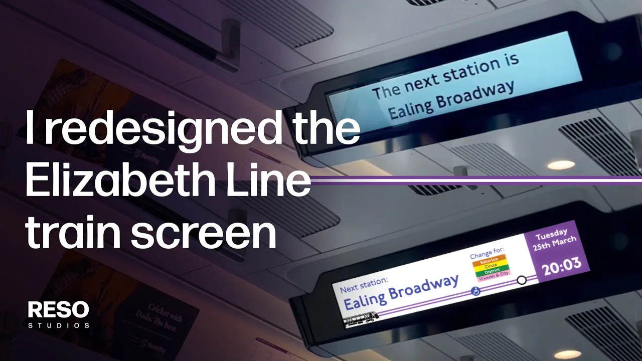
We noticed however that the information screen on the train wasn't properly optimised, compared the information screens that in Berlin, Budapest, or Barcelona.
A lot of information is scattered across multiple screens, and passengers would have to wait considerable time to see crucial info; such as the next station, the time of day, or where the train is going to.
London is a great city that deserves great things. For a screen this large, the potential for a better, more functional design was there, so we took it upon ourselves to create a new concept design that is more functional.
Challenge
Approach
Result
To redesign the information screen on the Elizabeth Line into something more practical and attractive-looking.
We tried to optimise the screen space as much as possible, by creating a new design system that displays more information simultaneously in one screening.
Small virality on LinkedIn, with over 500 likes, 90 comments, and 15 reposts, with many hailing the design to be much more helpful and better to look at.
Big screen. Big potential.
The biggest probelm we found with the current design is that there would be very long waiting times to see when the next station is, the connecting trains, and the date & time. With some stations, the next station and connecting trains are on two separate screens.
So we started with implementing a design where the next station, connecting tubes, and the date & time is always in constant view - so that whenever passengers look up at the screen, they instantly know where they're going next and how they're doing for time.
From there, we redesigned the old Train Delays layout into a single screen frame, by only showing the trains impacted.
Gradually, we started to have some fun by exploring other concepts:
Animating TfL Posters in the Screen
The remaining screenspace had a similar dimension ratio to the static TfL posters on the Elizabeth Line, so we explored what animated variations of the posters would look like if they were in the screen.
As fun as it were to create these animations from TfL's travelling posters, our verdict is that they wouldn't be suitable for the screen.
The Response
For the first iteration, the response has been mostly positive, with a lot of warm reception stating how it was a huge improvement.
"I hadn’t realised it needed to happen… but, YES! That is so very much clearer and easy to read/glance at for all the information I’d need displayed simply and cleanly. There’s also a touch of finesse. Really excellent work."
— David Holmes, Voice Actor
"Small detail, but really like that you've kept the date and time there as a constant. So annoying on the current layout where if you miss the time you have to wait forever until it comes back again."
— James Cook, Founder of FOSTER Studios
"This is amazing work, all the information is in a central place so I won't panick looking around for info, and it is visible too, I hope to see this being rolled out! It is great because I am neurodiverse."
— Tammy L S, London resident
It is understood that this video has reached the Transport for London Head Office, and has been heavily discussed internally, but we have not yet received an official response.
Accessibility
The core piece of constructive feedback we received were related to accessibility needs for the visually impaired, which we have listened to and are in agreement with. This concept design was created with no access to any accessibility design guidelines.
We would be very open to working with Transport for London to work on a new interation of this design that adheres to accessibility requirements.