
ELIzabeth line menu redesign
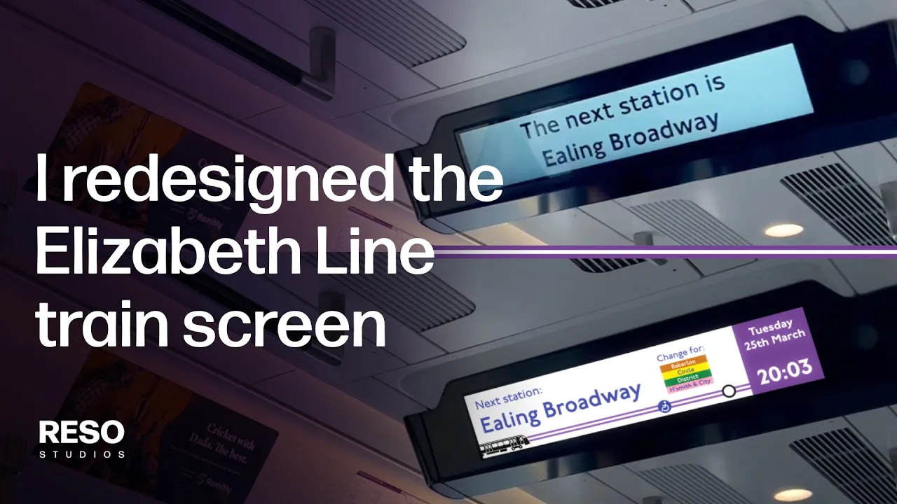
As a frequent traveller on this train, I've always felt like this information screen on the Elizabeth Line has a lot of missed potential.
The screen has a lot of area space, and the oversized text pushes messaging out across a lot of frames - making passengers wait a long time to see the information they need.
So I took a crack at redesigning it.
What do you think?


ELIZABETH LINE TRAIN ICON
This Elizabeth Line train icon you see here, I drew in Affinity Designer.
At first I made this colour version to layover in the motion graphics comp, however in the final scene it failed to stand out to my eye - as it was clashing against the mixture of the other vibrant, bright colours.
I referred back to the original design, and recoloured it to a pure black colour, which achieved the desired result.
ADDITIONAL TFL ICONOGRAPHY
I also took the liberty to include the step-free access information by referring the TfL Tube Map, so wheelchair users can know what to expect with manoeuvrability when they arrive at their station.

Step-free access from street to train

Step-free access from street to platform
